Pivot tables
What does the Visual Vocabulary say?
Deviation -
“Emphasise variations (+/-) from a fixed reference point. Typically the reference point is zero but it can also be a target or a long-term average. Can also be used to show sentiment (positive/neutral/negative). Example FT uses Trade surplus/deficit, climate change
The diverging bar is:
“A simple standard bar chart that can handle both negative and positive magnitude values.”
Ok, so let’s look at how to make one as bar charts are quite simple to make.
We’ll be using data from the gampinder package - which gives an excerpt from the gapminder dataset. If you don’t know about gapminder and the work of Hans Rosling and the rest of the gampinder team - then watch this video - to be fair, I’d recommend watching anything that Hans did.
The spec from the gapminder pacakge read-me shows the data includes:
| Variable | Meaning |
|---|---|
| country | |
| continent | |
| year | |
| lifeExp | life expectancy at birth |
| pop total | population |
| gdpPercap | per-capita GDP |
We’re going to have a look at lifeExp to see if there have been any changes. We’ll load up the tidyverse (I could just load up the dplyr, tidyr and ggplot2 packages here) and gapminder.
library(tidyverse)
## ── Attaching packages ────────────────────────────────────────────────────────────────────────────────────────────────────── tidyverse 1.3.0 ──
## ✓ ggplot2 3.3.0     ✓ purrr   0.3.3
## ✓ tibble  3.0.0     ✓ dplyr   0.8.5
## ✓ tidyr   1.0.2     ✓ stringr 1.4.0
## ✓ readr   1.3.1     ✓ forcats 0.5.0
## ── Conflicts ───────────────────────────────────────────────────────────────────────────────────────────────────────── tidyverse_conflicts() ──
## x dplyr::filter() masks stats::filter()
## x dplyr::lag()    masks stats::lag()
library(gapminder)
The library loads the gapminder data as a dataframe but it will not show in your global evironment - let’s have a look at it.
str(gapminder)
## tibble [1,704 × 6] (S3: tbl_df/tbl/data.frame)
##  $ country  : Factor w/ 142 levels "Afghanistan",..: 1 1 1 1 1 1 1 1 1 1 ...
##  $ continent: Factor w/ 5 levels "Africa","Americas",..: 3 3 3 3 3 3 3 3 3 3 ...
##  $ year     : int [1:1704] 1952 1957 1962 1967 1972 1977 1982 1987 1992 1997 ...
##  $ lifeExp  : num [1:1704] 28.8 30.3 32 34 36.1 ...
##  $ pop      : int [1:1704] 8425333 9240934 10267083 11537966 13079460 14880372 12881816 13867957 16317921 22227415 ...
##  $ gdpPercap: num [1:1704] 779 821 853 836 740 ...
The latest year we have data for is 2007 - so let’s do a comparison across 10 years for countries in Africa and see if life expectancy has gone up or down.
I’m also going to use pivot_wider() to change the shape of the dataframe and I’ll use mutate to calculate the difference in years from our new columns.
gapminder_africa <- gapminder %>%
  filter(year == 1997 | year == 2007) %>%
  filter(continent == "Africa") %>%
  select(country, year, lifeExp) %>%
  pivot_wider(id_cols =  country, names_from = year, values_from = lifeExp) %>%
  mutate(life_change = `2007` - `1997`)

str(gapminder_africa)
## tibble [52 × 4] (S3: tbl_df/tbl/data.frame)
##  $ country    : Factor w/ 142 levels "Afghanistan",..: 3 4 11 14 17 18 20 22 23 27 ...
##  $ 1997       : num [1:52] 69.2 41 54.8 52.6 50.3 ...
##  $ 2007       : num [1:52] 72.3 42.7 56.7 50.7 52.3 ...
##  $ life_change: num [1:52] 3.15 1.77 1.95 -1.83 1.97 ...
The first chart
We could create a new column which says the data is above or below zero - but we can use the fill = life_change > 0 within aes() to do that for us. Have a look at the code below.
ggplot(data = gapminder_africa,
       aes(x = country, y = life_change, fill = life_change > 0))+
  geom_bar(stat = "identity")
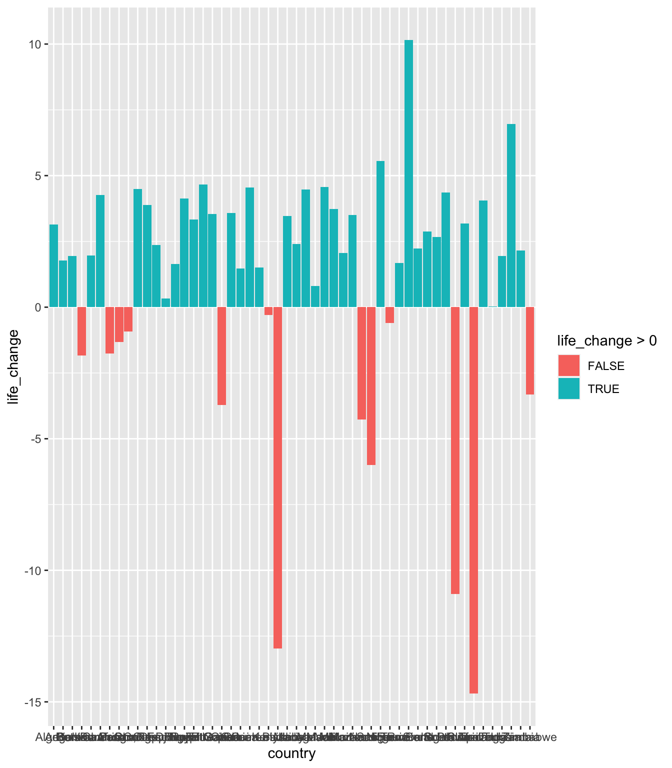
It has done what we wanted, but the order is set by the x axis, not what we want. Also, the x axis looks a mess - lots of names that are running into one another.
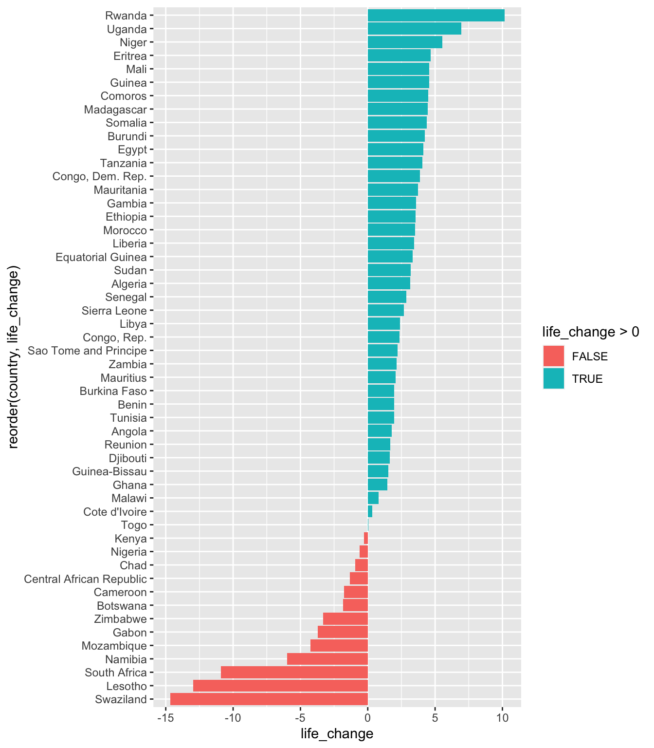
So, we’ll take the data set we want to work with and set the aes() like this:
- reorder the x axis by the life_change column - set it to the second argument in the reorder function
- set the y axis using the life_change values
- the fill line (life_change > 0) will set the data into two groups - above and below 0
We’ll also add coord_flip() to change it from a horizontal to a vertical chart.
ggplot(data = gapminder_africa,
       aes(x = reorder(country, life_change), y = life_change, fill = life_change > 0))+
  geom_bar(stat = "identity") +
  coord_flip()
Mutating the data
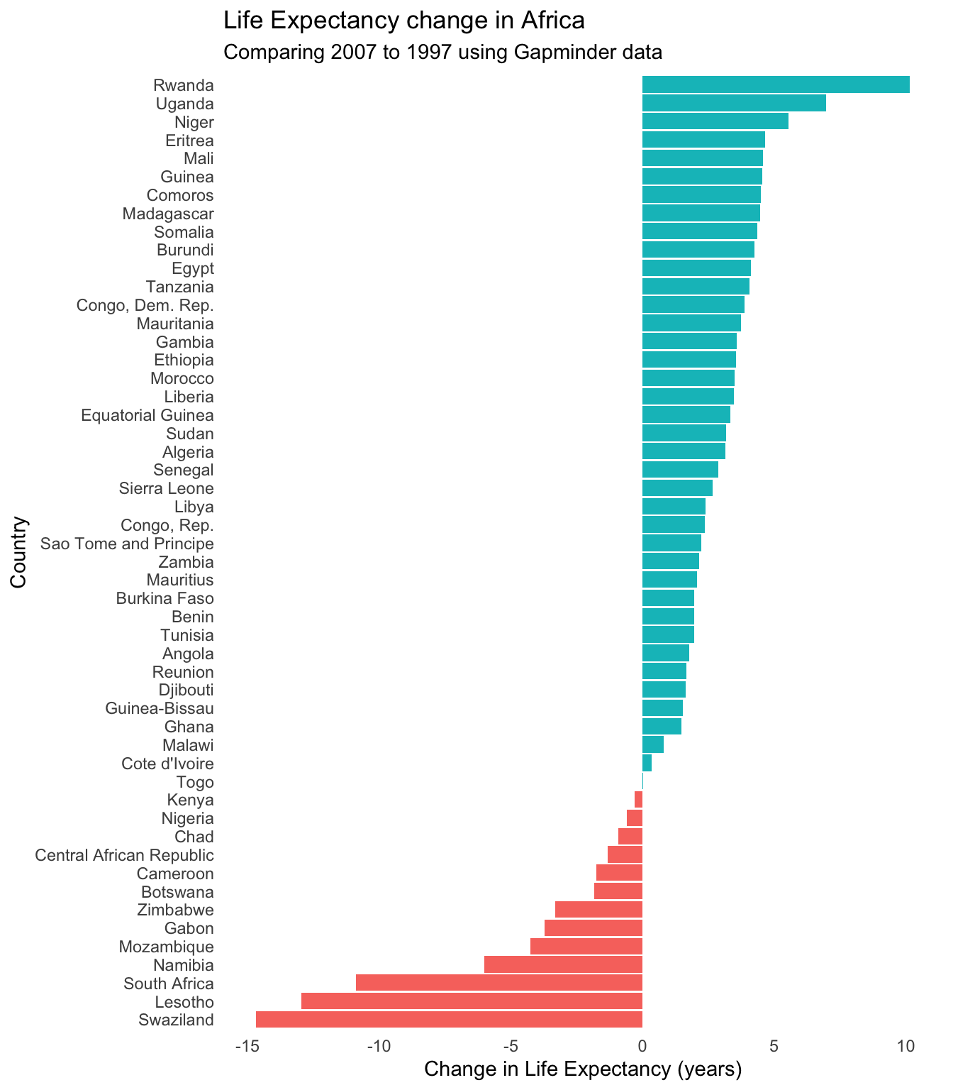
In the second version I’m going to create a column that contains the information about the changes using mutate(). This means the aes() can be filled by the life_change_pos column we’ll create. This is just to show how it is done.
I’ve also added a few more stylistic points to make it look nicer. Have a look at the section after coord_flip() to see what is going on.
gapminder_africa2 <- gapminder_africa %>%
  mutate(life_change_pos = life_change > 0)

ggplot(data = gapminder_africa2,
       aes(x = reorder(country, life_change), y = life_change, fill = life_change_pos))+
  geom_bar(stat = "identity") +
  coord_flip() +
  labs(x = "Country", y = "Change in Life Expectancy (years)",
       title = "Life Expectancy change in Africa",
       subtitles = "Comparing 2007 to 1997 using Gapminder data")+
  theme_minimal()+
  guides(fill = FALSE) +
  theme(panel.border = element_blank(),
        panel.grid.major = element_blank(),
        panel.grid.minor = element_blank())